Case study: Kringlan
A shopping center goes digital
A shopping center goes digital
Kringlan is Iceland’s favourite shopping center and the largest one in Reykjavik, housing more than 170 shops, service providers and restaurants. In september of 2018, Kringlan announced its plan to embrace technology and become what they called a digital shopping center, using digital products to supplement and enhance the overall customer experience. The ongoing trend in consumer behavior is that shopping is moving online, but an online experience will never fully replace the intimacy and tactile quality of physical retail.
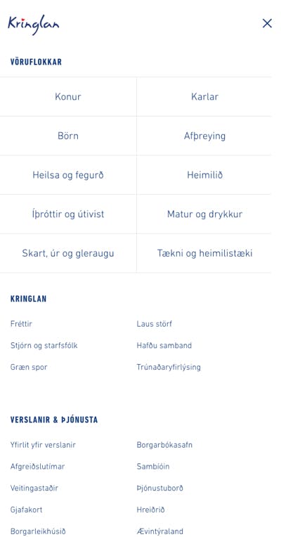
The strategy included installing interactive information displays around the mall, launching a mobile app, and last but not least: making the entire product selection of Kringlan’s shops available to browse online, aggregating tens of thousands of products from different sellers and inventory management systems. To achieve this, Kringlan teamed up with us at Kosmos & Kaos and digital transformation consultancy Parallel.
Project roles
Creative direction
Mobile/Responsive design
UI/UX design
Front-end development
Back-end development
Year
2018
Design decisions
We decided on a mobile-first approach for the design, not only because of web usage trends but also because we think it’s the best way to design a user experience for web applications and sites such as this one. It tends to sharpen the focus and weed out unnecessary complications early on in the process, prioritizing user needs every step of the way.
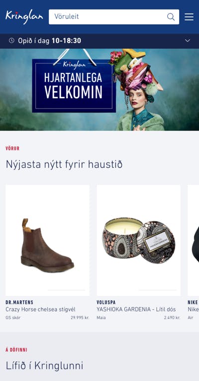
The look and feel is based on Kringlan’s newly updated brand, using shades of the main blue color for structure and bright red for accents, icons and the like. Their marketing material features lush photography and we use it to set the tone on the main page, giving ample space on larger screens to the detailed and highly polished studio scenes.
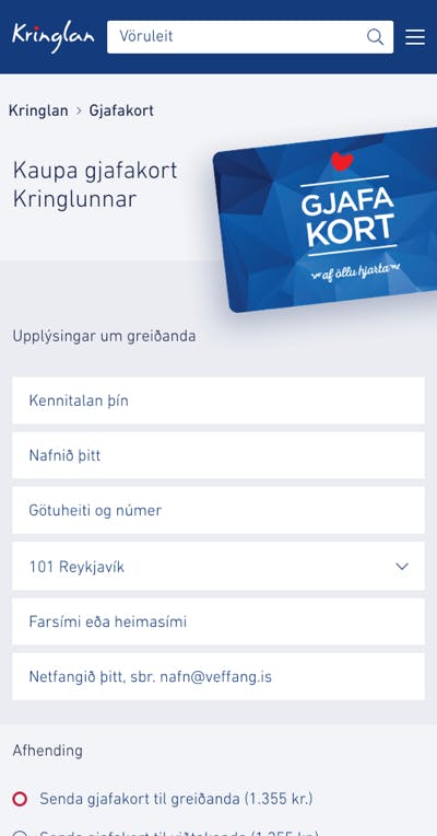
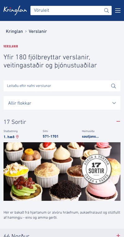
Although the website has other roles to fulfill, the products are the main focus and our core design choices reflect this. The product search box and categories are given priority over the main menu, so that the primary use case we cater to is searching for or browsing products. The products themselves are introduced right below the main header in a featured collection, curated by Kringlan’s editorial team. Product collections can also be featured in news, blog posts and other editorial content on the site.
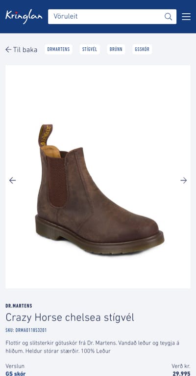
After selecting a category to browse or entering a search term, we land on the mainstay of the whole site: the product overview. Designed to be robust and easy to scan for information, we paid close attention to typographical hierarchy and contrast. The top slots in each category overview are selected by the editorial team in order to present an attractive variety of products and improve user experience, and as the products themselves are in focus we decided to place the sub-navigation and filters to the right. The filters are based on a highly scalable tag system that we designed to meet the challenge of organizing thousands of products without the costs and hassle of maintaining multi-level categories.
Each item is tagged with a brand name, the name of the store, and any number of relevant tags that describe the product. The shopkeepers tag their products themselves and the most popular tags float to the top of the list, so that for browsing purposes the most relevant tags are easily accessible. Having an extensive tag system in place also greatly improves search results.
Technical challenges
Gathering tens of thousands of products from different stores and making them accessible on the web was no easy task. The stores had different ways of managing inventory, some had e-commerce systems in place and others didn’t – not to mention the huge variety of products on offer, from clothing to cutlery and almost everything you could think of in between.
To meet this seemingly impossible task, we use an e-commerce integration platform from Tactica that connects to different inventory systems, gathers the relevant product information and makes it available through an API. We then feed the information into Elasticsearch, a cloud-based search and analytics engine that we use to manage the products, categories, tags and other data. The website was built with React and Next.js, and all content besides products is managed with a cloud-based headless CMS called Prismic, making the site fast-loading and easy to maintain going forward.
The app
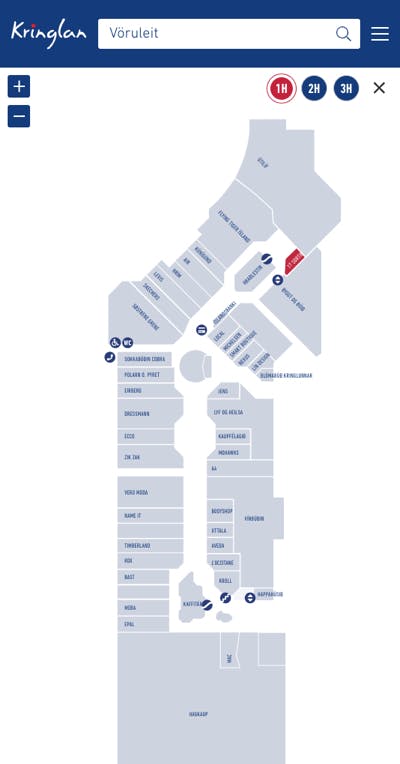
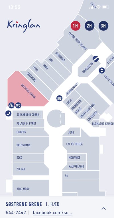
The mobile app is an important part of Kringlan’s long-term digital strategy and was designed to be steadily improved upon and expanded over time. In the initial release you can search for stores, locate them on an interactive map and access detailed information about each one. The app also offers a selection of up-to-the-minute special offers from the mall’s shops and restaurants. Future plans include making the product inventory available from within the app with an added layer of user-tailored features like wish lists, location-based services, arcade games and much more. We built the app with React Native, enabling us to use a single codebase for both Android and iOS, and the app shares a CMS with the website to make it easier for Kringlan to maintain their content going forward.
The overall experience
Being able to browse the entire product offering of its 150+ shops is a huge step forward in the digital journey of Kringlan and, by extension, for the shopkeepers and their growing number of digitally aware customers. With the first phase of the project completed, we will continue to develop and improve both platforms. Among other things, the plan is for kringlan.is to become a full-fledged online store, combining physical and digital retail to provide customers with the best of both worlds.